Splash screens form a very common pattern in mobile development. As simple as showing the user a beautiful logo and maybe doing some background loading may seem, I’ve seen many more flawed implementations than correct ones so far.

The Worst Possible Way

If you want to display a static layout, wait a few moments and load something else, you might be tempted to do this:

@Override
public void onCreate(Bundle savedInstanceState) {
    super.onCreate(savedInstanceState);
    setContentView(R.layout.splash);

    Thread.sleep(SPLASH_DURATION_MS);

    startActivity(this, MainActivity.class);
    finish();
}

This is absolutely horrible. The Thread.sleep() call blocks the UI thread, rendering the application unresponsive and possibly causing a force-close. This is absolutely not the way to go about it.

The Very Bad Way

To avoid blocking, you might resort to firing a thread, sleeping there, and calling runOnUiThread() to start the next Activity. This would effectively address the issue with the previous implementation. There’s no need to fire another thread just to let time go by, however. We can do better.

The Still Bad Way

Using Android’s Handler, you can post an event to the main UI loop and schedule it to run after a delay.

private Handler mHandler = new Handler();
    
@Override
public void onCreate(Bundle savedInstanceState) {
    super.onCreate(savedInstanceState);
    setContentView(R.layout.splash);
    
    mHandler.postDelayed(new Runnable() {
        public void run() {
            startActivity(new Intent(
                SplashActivity.this, MainActivity.class
            ));
            finish();
        }
    }, SPLASH_DURATION_MS);
}

Well, this is still bad, but for different reasons: even if the interface is responsive, and there’s nothing problematic going on in the code, you’re making the user wait for God knows how long on a splash screen that he might have seen a zillion times already. It’s a perfect recipe for turning “oh, cool design!” into “START already, dammit!”.

The Right Way ™

Using the Handler method described above, why don’t we let the user interrupt the wait by clicking on the splash screen? If he’s busy staring at our artwork, let him; if he’s impatient, he’ll try to click anywhere and manually skip the splash.

Let’s see the full code for that:

public class SplashActivity extends Activity {
    
    private static final int SPLASH_DURATION_MS = 2000;
    
    private Handler mHandler = new Handler();
    
    @Override
    public void onCreate(Bundle savedInstanceState) {
        super.onCreate(savedInstanceState);
        setContentView(R.layout.splash);
        
        mHandler.postDelayed(mEndSplash, SPLASH_DURATION_MS);
    }
    
    @Override
    public boolean onTouchEvent(MotionEvent event) {
        mEndSplash.run();
        return super.onTouchEvent(event);
    }
    
    private Runnable mEndSplash = new Runnable() {
        public void run() {
            if (!isFinishing()) {
                mHandler.removeCallbacks(this);

                startActivity(new Intent(
                    SplashActivity.this, MainActivity.class
                ));

                finish();
            }
        };
    };
}

Not so simple as Thread.sleep(), I admit, but correctly implemented and completely copy-pastable.
I’ve seen a lot of confusion on how to correctly create headers and footers in Activities with a ScrollView root. There’s also a lot of bad advice lying around, mostly involving RelativeLayout and resulting in headers and footers overlapping other parts of the UI when space is scarce.

We’ll take a look at a better solution using the much more simple LinearLayout.

To be on the same page, let’s agree on how we want our footers and/or headers to behave. First, however, some definitions. Our content, hosted inside a fullscreen ScrollView, will consist of:

  • Header (optional): this View‘s top will match the ScrollView‘s.
  • Body: this View will always be right below the header, and somewhere above the footer.
  • Footer (optional): this View‘s bottom will match the ScrollView‘s

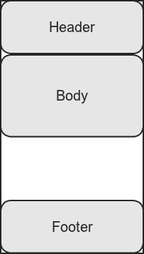
Good! Now, when the body’s content is smaller than the remaining space between the header and the footer, the layout will look like this:

Layout with no scrollbars

Layout with no scrollbars.

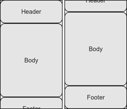
Unlike simple fixed headers and footers, however, ours will move out of the way if necessary. If the body’s size exceeds the available space, we want the layout to behave like this:

Layout with scrollbars

Layout with scrollbars. Left: scrolled to top; right: scrolled to bottom

Notice how, now that the screen’s size is not enough to display all of our content, the footer and the header are no longer anchored and respond to scrolling, without overlapping the body.

So, how do we get there? We use LinearLayout‘s layout_weight behavior to ensure that the body area will always expand to be at least as long as the remaining sandwiched space between the header and the footer. If the content’s shorter, it expands until it reaches the footer’s top; if it’s longer, it pushes the footer down.

<?xml version="1.0" encoding="utf-8"?>
<ScrollView xmlns:android="http://schemas.android.com/apk/res/android" 
    android:layout_width="fill_parent"
    android:layout_height="fill_parent"
    android:fillViewport="true">

<LinearLayout
    android:layout_width="fill_parent"
    android:layout_height="wrap_content"
    android:orientation="vertical">

    <!-- HEADER -->
    <LinearLayout
        android:layout_width="fill_parent"
        android:layout_height="wrap_content"
        android:orientation="vertical"
    />

    <!-- BODY -->
    <LinearLayout
        android:layout_width="fill_parent"
        android:layout_height="0dip"
        android:layout_weight="1"
        android:orientation="vertical"
    />

    <!-- FOOTER -->
    <LinearLayout
        android:layout_width="fill_parent"
        android:layout_height="wrap_content"
        android:orientation="vertical"
    />
</LinearLayout>
</ScrollView>

VoilĂ !

Obviously, the header and the footer can be omitted. They are not both mandatory, the same technique will work for just a header, or just a footer.

If you’ve read this far, well, I hope this helped you. You are more than welcome to contact me with doubts, suggestions or corrections.

Saludos!

A few days ago, I spent a few minutes recovering an URL from my browser history. I didn’t know what I was looking for well enough to just filter the entries, but I was sure I’d recognize it as soon as I saw it. However, I had had that tab open (and idle) for quite some time, even if I had only recently closed it, so the log entry was way farther down the list than I expected. In other words, in my mind’s recollection of my browser usage, reading that site was recent activity; but for the software, it was old news.

Since the introduction of tabs in web browsers, our browsing history stopped being linear. Tabs allow us to branch out of our current set of visited site logs, introducing a new, parallel timeline. However, history features in current web browsers still display activity linearly and, as a result, do not reflect our actual usage experience. Sites we were reading moments ago can be drowned under tons of unrelated history entries if we have a few overactive tabs.

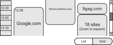
It would be nice to see parallel timelines accurately represented in the way we display browser history. The linear entry-list is usually good enough to find stuff (since you can usually filter it down to a few items), but nowhere near accurate when it comes to visually representing our recent usage of the program.

So, how about…

Bare-bones mock design for browser history

I think this is quite an interesting problem, if not that problematic. We could be getting much more out of browser history. You are more than welcome to share your ideas in the comments!